I’d like to make something in between a box plot [1] and a histogram. Each histogram would be represented by a single, tall, rectangular patch (like the box in a box plot), and the patch would be subdivided by the bin edges of the histogram. The face color of each sub-patch would replace the bar height in the histogram.
If any of that actually made sense:
-
Does this type of plot have a name?
-
Is there an easy way to do this in Matplotlib?
-
If there isn’t an easy way, what would be a good starting point? Initial ideas: 1) Use pcolor or imshow and embed this axes in a larger axes, 2) represent the sub-patches as a PolyCollection.
Thoughts?
-Tony
[1] e.g. http://matplotlib.sourceforge.net/examples/pylab_examples/boxplot_demo.html
Tony,
I am not quite sure I understand.
[snip]
Or maybe something else in the gallery is more like what you want:
http://matplotlib.sourceforge.net/gallery.html
Ben Root
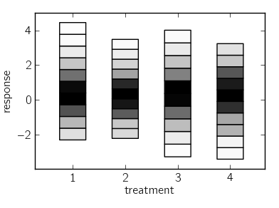
I’ve checked the gallery, but I don’t see anything that appears similar. In any case, I ended up hacking together something that works. I’ve attached an image of what I had in mind (created with the code at the very bottom of this reply).
I ended up using mpl Rectangle objects and stringing them together using a PatchCollection. Maybe there’s a more efficient way to do this, but this approach worked well-enough.
Best,
-Tony
“”"
First attempt at a histogram strip chart (made up name).
if-main block taken from [1] except that I’ve replaced uniform distributions
with normal distributions.
[1] http://matplotlib.sourceforge.net/examples/pylab_examples/boxplot_demo3.html
“”"
import numpy as np
import matplotlib.pyplot as plt
from matplotlib import collections
NORM_TYPES = dict(max=max, sum=sum)
class BinCollection(collections.PatchCollection):
def init(self, hist, bin_edges, x=0, width=1, cmap=plt.cm.gray_r,
norm_type=‘max’, **kwargs):
yy = (bin_edges[:-1] + bin_edges[1:])/2.
heights = np.diff(bin_edges)
bins = [plt.Rectangle((x, y), width, h) for y, h in zip(yy, heights)]
norm = NORM_TYPES[norm_type]
fc = cmap(np.asarray(hist, dtype=float)/norm(hist))
super(BinCollection, self).init(bins, facecolors=fc, **kwargs)
def histstrip(x, positions=None, widths=None, ax=None):
if ax is None:
ax = plt.gca()
if positions is None:
positions = range(1, len(x) + 1)
if widths is None:
widths = np.min(np.diff(positions)) / 2. * np.ones(len(positions))
for data, x_pos, w in zip(x, positions, widths):
x_pos -= w/2.
hist, bin_edges = np.histogram(data)
bins = BinCollection(hist, bin_edges, width=w, x=x_pos)
ax.add_collection(bins, autolim=True)
ax.set_xticks(positions)
ax.autoscale_view()
if name == ‘main’:
import matplotlib.pyplot as plt
import numpy as np
np.random.seed(2)
inc = 0.1
e1 = np.random.normal(0,1, size=(500,))
e2 = np.random.normal(0,1, size=(500,))
e3 = np.random.normal(0,1 + inc, size=(500,))
e4 = np.random.normal(0,1 + 2*inc, size=(500,))
treatments = [e1,e2,e3,e4]
fig, ax = plt.subplots()
pos = np.array(range(len(treatments)))+1
histstrip(treatments, ax=ax)
ax.set_xlabel(‘treatment’)
ax.set_ylabel(‘response’)
fig.subplots_adjust(right=0.99,top=0.99)
plt.show()
···
On Oct 1, 2010, at 9:40 AM, Benjamin Root wrote:
On Thu, Sep 30, 2010 at 8:44 PM, Tony S Yu <tsyu80@…287…> wrote: