Ah, I just noticed that.
Actually, I think I just figured out what is happening. The colorbar
automatically chooses what values to display, and in your case, the
values are 0.0, -0.4, -0.8, -1.2, -1.6, ..., -3.6, which when turned
into integers are 0, 0, 0, -1, -1, ..., -3, which matches what your
Right, good eye!
first plot had. All we have to do is specify the values that the
colorbar should list. I am not very familiar with this aspect, but it
has something to do with specifying your colormap and/or the normalizer.
The tick locations can be specified via the ticks kwarg to colorbar. From the docstring:
*ticks* [ None | list of ticks | Locator object ]
If None, ticks are determined automatically from the
input.
*format* [ None | format string | Formatter object ]
If None, the
:class:`~matplotlib.ticker.ScalarFormatter` is used.
If a format string is given, e.g. '%.3f', that is
used. An alternative
:class:`~matplotlib.ticker.Formatter` object may be
given instead.
The OP may also wish to specify the range of the colormap via the vmin and vmax kwargs to pcolor (note that everything to do with the colormap and the norm is specified in pcolor, not in the call to colorbar.
The OP probably does not need to specify both the formatter and the ticker. If it is certain that the range of values will be substantially geater than one, and integer tick values are desired, then try this:
int_ticker = MaxNLocator(nbins=6, integer=True)
cbar = colorbar(ticks=int_ticker)
nbins is the maximum number of intervals (one less than the max number of ticks).
The default formatter will print integers as integers, so no custom formatter is needed. Specifying a custom format or formatter is risky because, as illustrated by your diagnosis of the OP's original problem, it can easily lead to labels that are not accurate representations of the tick values.
Does anybody know of a good tutorial on creating colormaps and normalizers?
Custom norms are rare, and I don't think there is much in the way of documentation or examples. The code in ticker.py is probably the best starting place for learning about customizing norms; it includes subclasses of Normalize. Colormaps are illustrated fairly well in the examples. See the second example in http://matplotlib.sourceforge.net/examples/pylab_examples/contourf_demo.html for ListedColormap, see http://matplotlib.sourceforge.net/examples/pylab_examples/contourf_demo.html for examples of how to use the somewhat complicated LinearSegmentedColormap to generate a custom map, and http://matplotlib.sourceforge.net/examples/pylab_examples/show_colormaps.html for a view of built-in colormaps.
Eric
···
On 06/24/2010 04:03 AM, Benjamin Root wrote:
Ben Root
On Thu, Jun 24, 2010 at 8:53 AM, Benoit Donnet > <Benoit.Donnet@...1656... <mailto:Benoit.Donnet@…1656…>> wrote:
Hello Benjamin,
Thanks for your reply.
Is there any particular reason why you can't do a log10() of the
data that is being pcolor()'d and then label the colorbar as
having units of dB? That would seem to be the most
straight-forward approach to me.
That's what I first tested.
In that case, labels on the colorbar are the following (i don't
attach the plot to avoid spamming the entire mailing-list): 0.0,
-0.4, -0.8, -1.2, -1.6, ..., -3.6). It does not mean anything :s
Benoit
Ben Root
2010/6/24 Benoit Donnet <benoit.donnet@...1656...
<mailto:benoit.donnet@…1656…>>
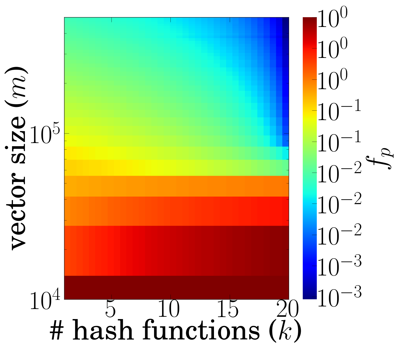
Hi guys,
I'm struggling with colorbar since this morning. I'd like the
colorbar being logscale
I'm experimenting some strange behavior with the colorbar as
some 'labels' appear several times. For instance, 10^0
appears three times, 10^1 appears also three times, and so on.
I believe the exponent is the digit of the float, while I'd
like to see the exponent (of the scientific notation)
I attach a png of the plot
Here is my code:
k,m,fp = np.loadtxt(file, unpack=True)
ki = linspace(k.min(), k.max(), 37)
mi = linspace(m.min(), m.max(), 37)
Z = griddata(k, m, fp, ki, mi)
Z.shape
K, M = meshgrid(ki, mi)
pcolor(K, M, log10(Z))#, cmap=cm.gray)
cbar = colorbar(format=FormatStrFormatter('10^\{%d\}'))
semilogy()
axis([1,20,10000,500000], font2)
xlabel(r'\textrm{\# hash functions (k)}', font)
ylabel(r'\textrm{vector size (m)}', font)
cbar.ax.set_ylabel(r'f\_p', font)
I obviously suspect my code is flawed somewhere but I can't
figure out where. i have tested several format for the
colorbar, like LogFormatterMathText, but it does not solve my
problem.
I would appreciate any kind of help. Thanks in advance
Keep on Rockin'
Benoit
---
Dr. Benoit Donnet
Université catholique de Louvain (UCL)
Ecole Polytechnique de Louvain (EPL) - Département
d'Ingénierie Informatique (INGI)
Place Sainte Barbe, 2
B-1348 Louvain-la-Neuve
Phone: +32 10 47 87 18
Fax: +32 10 45 03 45
------------------------------------------------------------------------------
ThinkGeek and WIRED's GeekDad team up for the Ultimate
GeekDad Father's Day Giveaway. ONE MASSIVE PRIZE to the
lucky parental unit. See the prize list and enter to win:
http://p.sf.net/sfu/thinkgeek-promo
_______________________________________________
Matplotlib-users mailing list
Matplotlib-users@lists.sourceforge.net
<mailto:Matplotlib-users@lists.sourceforge.net>
matplotlib-users List Signup and Options
---
Dr. Benoit Donnet
Université catholique de Louvain (UCL)
Ecole Polytechnique de Louvain (EPL) - Département d'Ingénierie
Informatique (INGI)
Place Sainte Barbe, 2
B-1348 Louvain-la-Neuve
Phone: +32 10 47 87 18
Fax: +32 10 45 03 45
------------------------------------------------------------------------------
ThinkGeek and WIRED's GeekDad team up for the Ultimate
GeekDad Father's Day Giveaway. ONE MASSIVE PRIZE to the
lucky parental unit. See the prize list and enter to win:
http://p.sf.net/sfu/thinkgeek-promo
_______________________________________________
Matplotlib-users mailing list
Matplotlib-users@lists.sourceforge.net
matplotlib-users List Signup and Options