Perhaps you would be better off making your own colormap considering that your data is not symmetric around zero. You could do something like the following:
···
import numpy as np
import matplotlib.pyplot as plt
import matplotlib.colors as plc
data = np.random.randn(12,72)
data = data*5. - 5.
zero = -1*data.min()/(data.max() - data.min())
cdict = {‘red’: [(0.0, 1.0, 1.0),
(zero, 1.0, 1.0),
(1.0, 0.0, 0.0)],
‘green’: [(0.0, 0.0, 0.0),
(zero, 1.0, 1.0),
(1.0, 0.0, 0.0)],
‘blue’: [(0.0, 0.0, 0.0),
(zero, 1.0, 1.0),
(1.0, 1.0, 0.0)],
}
cmap = plc.LinearSegmentedColormap(‘cmap’, cdict, N=1000)
mappable = plt.cm.ScalarMappable(cmap=cmap)
mappable.set_array(data)
fig = plt.figure()
plt.pcolormesh(data, cmap=cmap)
fig.colorbar(mappable)
plt.show()
Of course, the zero calculation assumes that zero actually exists in your data set. That can be fixed with a simple if…else statement if you want this to be more robust.
You can get rid of a few lines from this code if you don’t want to set a ScalarMappable object. However, I was doing some stuff with line collections where I wanted some colors to have an alpha associated with them, and I found that I was losing that info with the simpler pyplot interface for colorbar generation. So I left in the slightly more complex code for reference. (This might be changed in newer versions of mpl, I just haven’t needed to rework my code to check.)
Ryan
On Fri, Oct 12, 2012 at 4:17 AM, Andreas Hilboll <lists@…3067…> wrote:
Hi,
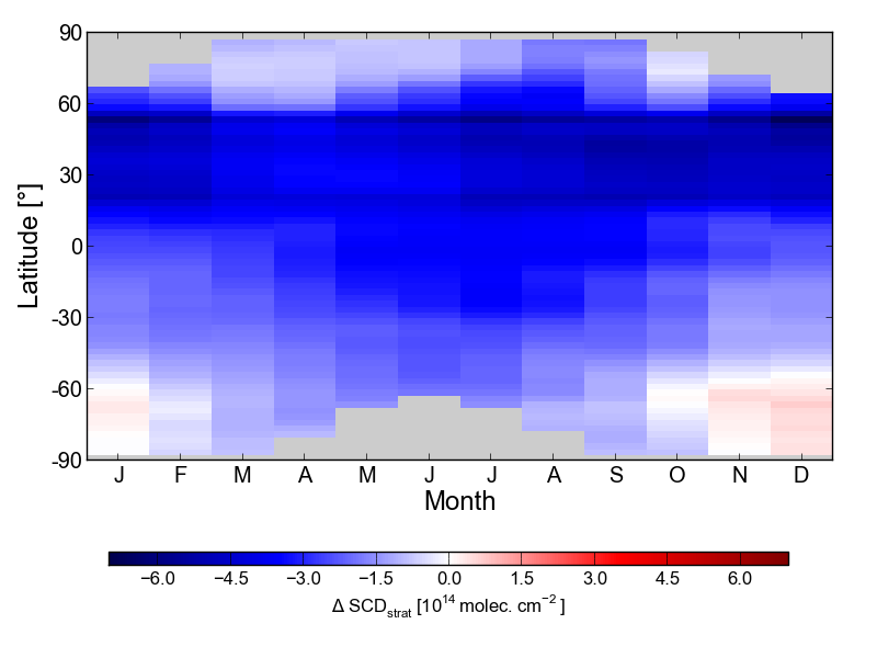
I have some data I want to plot using pcolormesh. It’s 2d climatological
data, see the attached plot. My data is in a range from -7 to +0.6. I want
to be 0.0 to be clearly visible, while at the same time, the color range
should show the full dynamic of the values. I played with the bwr and
seismic color maps, centering on zero, so that white is 0.0. However, I’m
not too happy with the dynamic range I get in the negative.
Any suggestions are very welcome …
Cheers, Andreas.
Don’t let slow site performance ruin your business. Deploy New Relic APM
Deploy New Relic app performance management and know exactly
what is happening inside your Ruby, Python, PHP, Java, and .NET app
Try New Relic at no cost today and get our sweet Data Nerd shirt too!
http://p.sf.net/sfu/newrelic-dev2dev
Matplotlib-users mailing list
Matplotlib-users@lists.sourceforge.net
https://lists.sourceforge.net/lists/listinfo/matplotlib-users