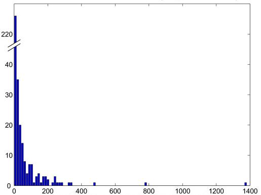
Hi, group,
I am wondering if matplotlib can make a plot look like the
attached one. Basically, the y-axis was collapsed to show both one
extreme value and the rest of smaller values.
Thanks.
Chunlei
Hi, group,
I am wondering if matplotlib can make a plot look like the
attached one. Basically, the y-axis was collapsed to show both one
extreme value and the rest of smaller values.
Thanks.
Chunlei
I don't know how to make the "//" symbol in the y-axis, but if you have two plots that share the same x-axis, you can represent this kind of data.
The "Working with multiple figure and axes" section of the tutorial
http://matplotlib.sourceforge.net/tutorial.html
is almost right; if you turn off the display of the x-axis in the upper plot, it will be even better.
&C
On Oct 19, 2006, at 3:05 PM, CL wrote:
Hi, group,
I am wondering if matplotlib can make a plot look like the attached one. Basically, the y-axis was collapsed to show both one extreme value and the rest of smaller values.Thanks.
Chunlei
<moz-screenshot.jpg>
<moz-screenshot.jpg>
-------------------------------------------------------------------------
Using Tomcat but need to do more? Need to support web services, security?
Get stuff done quickly with pre-integrated technology to make your job easier
Download IBM WebSphere Application Server v.1.0.1 based on Apache Geronimo
http://sel.as-us.falkag.net/sel?cmd=lnk&kid=120709&bid=263057&dat=121642_______________________________________________
Matplotlib-users mailing list
Matplotlib-users@lists.sourceforge.net
matplotlib-users List Signup and Options
I was thinking of something like this - it isn't pretty, but it does get all the data on the page.
import pylab
# Annoying-to-plot data
data=[1]*100 + [2]*3 + [3]*2+ [4]*3 + [5]
# Make a histogram out of the data in x and prepare a bar plot.
top = pylab.subplot(211)
vals, bins, patchs = pylab.hist(data)
# but only show the top fraction of the graph in the upper plot
top.set_ylim(max(vals)-2, max(vals)+2)
bot = pylab.subplot(212)
vals, bins, patchs=pylab.hist(data)
bot.set_ylim(0,4)
pylab.show()