Erik Wickstrom schrieb:
Hi all,
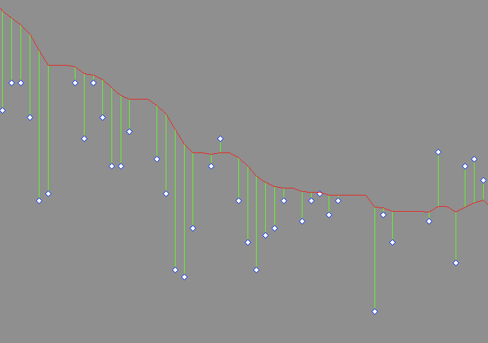
Can matplotlib (or any other Python charting library) generate charts
like this: (also attached if you prefer)
Here is a demo-script. The second way is inspired by matlab. Can this be
done more easily in python? Can X and Y be built more elegantly with numpy?
Armin
-------8<------------------------
from pylab import *
# data generation
x = linspace(0,10,100)
y = exp(-x)
ye = y + rand(y.size)-0.5
# plot the vertical lines
# with loop
for xl,yl,yel in zip(x,y,ye):
plot([xl,xl],[yl,yel],'r')
plot(x,y,x,ye,'d')
# plot by separating with NaN
figure()
X = zeros((x.size,3))
Y = zeros((x.size,3))
X[:,0],X[:,1],X[:,2] = x,x,NaN
Y[:,0],Y[:,1],Y[:,2] = y,ye,NaN
plot(X.flatten(),Y.flatten(),x,y,x,ye,'d')
show()
-------8<------------------------