Hi all,
Since we're considering the possibility of making a matplotlib 2.0
release with a better default colormap, it occurred to me that it
might make sense to take this opportunity to improve other visual
defaults.
Defaults are important. Obviously for publication graphs you'll want
to end up tweaking every detail, but (a) not everyone does but we
still have to read their graphs, and (b) probably only 1% of the plots
I make are for publication; the rest are quick one-offs that I make
on-the-fly to help me understand my own data. For such plots it's
usually not worth spending much/any time tweaking layout details, I
just want something usable, quickly. And I think there's a fair amount
of low-hanging improvements possible.
Batching multiple visual changes like this together seems much better
than spreading them out over multiple releases. It keeps the messaging
super easy to understand: "matplotlib 2.0 is just like 1.x, your code
will still work, the only difference is that your plots will look
better by default". And grouping these changes together makes it
easier to provide for users who need to revert back to the old
defaults -- it's easy to provide simple binary choice between "before
2.0" versus "after 2.0", harder to keep track of a bunch of different
changes spread over multiple releases.
Some particular annoyances I often run into and that might be
candidates for changing:
- The default method of choosing axis limits is IME really, really
annoying, because of the way it tries to find "round number"
boundaries. It's a clever idea, but in practice I've almost never seen
this pick axis limits that are particularly meaningful for my data,
and frequently it picks particularly bad ones. For example, suppose
you want to plot the spectrum of a signal; because of FFT's preference
for power-of-two sizes works it's natural to end up with samples
ranging from 0 to 255. If you plot this, matplotlib will give you an
xlim of (0, 300), which looks pretty ridiculous. But even worse is the
way this method of choosing xlims can actually obscure data -- if the
extreme values in your data set happen to fall exactly on a "round
number", then this will be used as the axis limits, and you'll end up
with data plotted directly underneath the axis spine. I frequently
encounter this when making scatter plots of data in the 0-1 range --
the points located at exactly 0 and 1 are very important to see, but
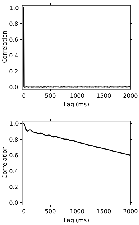
are nearly invisible by default. A similar case I ran into recently
was when plotting autocorrelation functions for different signals. For
reference I wanted to include the theoretically ideal ACF for white
noise, which looks like this:
plt.plot(np.arange(1000), [1] + [0] * 999)
Good luck reading that plot!
R's default rule for deciding axis limits is very simple: extend the
data range by 4% on each side; those are your limits. IME this rule --
while obviously not perfect -- always produces something readable and
unobjectionable.
- Axis tickmarks should point outwards rather than inwards: There's
really no advantage to making them point inwards, and pointing inwards
means they can obscure data. My favorite example of this is plotting a
histogram with 100 bins -- that's an obvious thing to do, right? Check
it out:
plt.hist(np.random.RandomState(0).uniform(size=100000), bins=100)
This makes me do a double-take every few months until I remember
what's going on: "WTF why is the bar on the left showing a *stacked*
barplot...ohhhhh right those are just the ticks, which happen to be
exactly the same width as the bar." Very confusing.
Seaborn's built-in themes give you the options of (1) no axis ticks at
all, just a background grid (by default the white-on-light-grey grid
as popularized by ggplot2), (2) outwards pointing tickmarks. Either
option seems like a better default to me!
- Default line colors: The rgbcmyk color cycle for line plots doesn't
appear to be based on any real theory about visualization -- it's just
the corners of the RGB color cube, which is a highly perceptually
non-uniform space. The resulting lines aren't terribly high contrast
against the default white background, and the different colors have
varying luminance that makes some lines "pop out" more than others.
Seaborn's default is to use a nice isoluminant variant on matplotlib's default:
http://web.stanford.edu/~mwaskom/software/seaborn/tutorial/aesthetics.html
ggplot2 uses isoluminant colors with maximally-separated hues, which
also works well. E.g.:
http://www.cookbook-r.com/Graphs/Colors_(ggplot2)/ggplot2_scale_hue_colors_l45.png
- Line thickness: basically every time I make a line plot I wish the
lines were thicker. This is another thing that seaborn simply changes
unconditionally.
In general I guess we could do a lot worse than to simply adopt
seaborn's defaults as the matplotlib defaults  Their full list of
overrides can be seen here:
https://github.com/mwaskom/seaborn/blob/master/seaborn/rcmod.py#L135
https://github.com/mwaskom/seaborn/blob/master/seaborn/rcmod.py#L301
- Dash styles: a common recommendation for line plots is to
simultaneously vary both the color and the dash style of your lines,
because redundant cues are good and dash styles are more robust than
color in the face of greyscale printing etc. But every time I try to
follow this advice I find myself having to define new dashes from
scratch, because matplotlib's default dash styles ("-", "--", "-.",
":") have wildly varying weights; in particular I often find it hard
to even see the dots in the ":" and "-." styles. Here's someone with a
similar complaint:
http://philbull.wordpress.com/2012/03/14/custom-dashdot-line-styles-in-matplotlib/
Just as very rough numbers, something along the lines of "--" = [7,
4], "-." = [7, 4, 3, 4], ":" = [2, 1.5] looks much better to me.
It might also make sense to consider baking the advice I mentioned
above into matplotlib directly, and having a non-trivial dash cycle
enabled by default. (So the first line plotted uses "-", second uses
"--" or similar, etc.) This would also have the advantage that if we
make the length of the color cycle and the dash cycle relatively
prime, then we'll dramatically increase the number of lines that can
be plotted on the same graph with distinct appearances. (I often run
into the annoying situation where I throw up a quick-and-dirty plot,
maybe with something like pandas's dataframe.plot(), and then discover
that I have multiple indistinguishable lines.)
Obviously one could quibble with my specific proposals here, but does
in general seem like a useful thing to do?
-n
···
--
Nathaniel J. Smith
Postdoctoral researcher - Informatics - University of Edinburgh
http://vorpus.org