Wanted to share a tiny project (which had some help from @tacaswell in Different outputs in notebook and script):
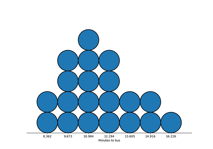
This is a small, 2 function library, for creating quantile dotplots, which were described in Kay, Kola, Hullman, and Munson’s “When(ish) is My Bus”.
They are an efficient uncertainty visualization, so that each dot represents 5% of the data. In the below, one could count that ~10% of the time, the bus arrives in less than 8.4 minutes
